
NightBaron
Well-known member
I'll directly cut to the chase
I was thinking if u guys can manage space better?
for eg
here I mean,there is a lot of empty space
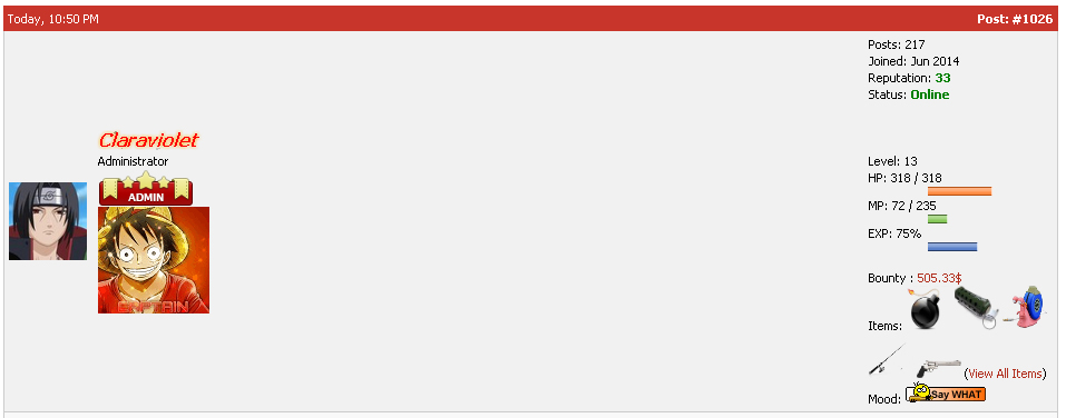
and I feel a lot of space is consumed just to show info about the member
there are some unnecessary things like ,what items a user has
also the profile pic is way too small
here I have tried to make it concise and done the other stuff I mentioned
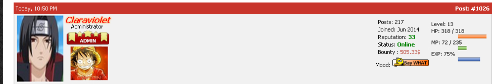
another thing is in the theme
how about adding a pattern to the bars and all
i am sure u are confused
this is what I am talking
on top is the current theme
and below I have added a pattern to make it more interesting
so how do like this suggestion ?
it would be great if u can do the 1st
the 2nd one well
I don't know how many would like it
so its upto u
I was thinking if u guys can manage space better?
for eg
here I mean,there is a lot of empty space
and I feel a lot of space is consumed just to show info about the member
there are some unnecessary things like ,what items a user has
also the profile pic is way too small
here I have tried to make it concise and done the other stuff I mentioned
another thing is in the theme
how about adding a pattern to the bars and all
i am sure u are confused
this is what I am talking
on top is the current theme
and below I have added a pattern to make it more interesting
so how do like this suggestion ?
it would be great if u can do the 1st
the 2nd one well
I don't know how many would like it
so its upto u
